Above are the initial boards with my original designs that I submitted to Lexarts. On the left, is the preliminary mock-up for "A Window to the Wellspring" Barrel. My plan was to cut a hole in the barrel and make an actual window out of plexiglass and put a waterway flowing through the barrel that you would see through the window. The grass coming out of the spigot on the left side is to represent the growth of the bluegrass, and the water coming out of the spigot on the right represents the flowing of the waterway through Lexington. The citiscape of Lexington is shown with a gradual progression from night to day. Some of the town buildings are bourbon bottles. I was asked not to cut a hole in the barrel because it would upset the stability of the barrel, so I just painted a window instead.
The barrel design on the right was for "The Bourbon Trail" Barrel. The idea was to do the logos from all the distilleries in Kentucky. This barrel included the Buffalo Trace Logo, but then I was told that Buffalo Trace was not on the Bourbon Trail. I was actually really drawn to their logo, but I was told that they keep their tours free, so they chose not to pay any fees associated with promotion in that way. However, I could not include their logo on the actual barrel, so I changed the barrel design to include the logos of all of the distilleries on the bourbon trail.
After the staining and preparing the barrel, I chalked all of the logo designs onto the barrel, then I base coated them. I didn't do a good job of documenting that part of the process because I was in such a hurry to get at least one of them done, and as I usually do, I got so engrossed in what I was doing that I forgot to stop and document. Sorry for the lack of preliminary pictures. The picture below was taken before the 3rd coat on lettering and design.
In my original plan for this barrel, I was going to write up the history of Bourbon in Kentucky and put it on Historical Markers on each end, but after I finished writing out the 3 page essay, I decided there was no way anyone would stand there and read all of that, nor would it fit on the barrel, nor did I want to paint all of those letters, so I decided to write up the history of the Bourbon Trail instead, and I made a marker only on one side. I originally wanted to paint the letters exactly as they appear on the markers, but I decided to go with a more artistic loose font which I felt added a sense of whimsy to an otherwise very serious type historical marker. I didn't want it to feel too serious.
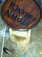
Sometimes you really take for granted how much time and thought and symbolism goes into a logo. I have become quite the student of Logos and I am most impressed with the Town Branch Logo, but it was really hard to paint. I redid the "map of Lexington" part of it several times before I got it right and I'm still not sure it is exact, but the clock was ticking.
I realized that possibly by accident, all of the distillery logos tend to have the same colors in them. It worked great for me, because all of the colors complimented each other. I really enjoyed painting all of the seals. Painting lettering on a splintery rough rounded barrel had its challenges, but overall, I really loved every minute of it.
As you can see in the JIM BEAM logo, I had to draw out the logo as if the bands weren't there, but I decided that I really wanted to maintain the integrity of the barrel, so keeping the wood showing and the bands separate from the painting was important to me.
Maker's Mark is a personal favorite bourbon of mine, so I wanted it to have a special place on the barrel. I chose to make the cork that is on the top of the barrel, the center of the Makers Mark seal. In my early plan, I thought I would drip red wax down from this seal to sides of the barrel, but I couldn't find the true thick red wax, and the logo ended up being really close to the others, so I didn't want to chance it running onto them. In the end, I felt it would look better without it.
The Wild Turkey was so fun to do, and was a relief for me at the time I did it because I had been doing so many letters, so I was really proud of how he turned out. I only wish I could have fit more of him. He is a big guy
When all the logos were done, I had to turn it on end, to be able to paint the bands all the way around. I first primed them, and then I painted them copper. I love copper and I use it a lot in my work. I am still pleased that I did it, but when I see the pictures of the original bands, they were beautiful too. They would have rusted again in the weather, so this is a better way to preserve it.
I had not had the Kentucky Bourbon Trail logo in any of my early plans for this barrel, but I had a hole on the barrel, so I decided to paint it on there in that spot. After I did, both my husband and I loved the way the colors in it really stood out and it looked great on the barrel. Since I had made the earlier change on the Historical Marker, I decided that this logo was what had to go on the other end. I love it and I am so glad that I made that change. It just made sense.
At this point, I had had Chad build a second stand, and set up the second barrel, so I had already sanded the barrel and stained it and scoured the rust of the bands, during down time on the other barrel.
But I waited to start the design phase until I finished the other barrel.
X marks the spot. Can you see it? This is the moment where I knew I could not turn back. There was no messing this up.... I had to drill the hole into the barrel on each end for the spigots. It had to be just the right size and it had to line up with the other hole on the other side, because I wanted to put a pvc connector pipe in between them for stability. So I measured twice.... ALWAYS measure twice and then one more time just to be sure.... WORDS OF MY FATHER.
It seemed like it took an unusually long time to get to the inside of the barrel, but then I did, and all of a sudden the sweet smell of that Kentucky Spirit filled the air around me. One of the highlights of the whole project. I don't know why I loved that moment, but it was like I had just found gold at the end of a rainbow. Its not like I thought it would smell like anything else, I just didn't expect it to be so powerful.
So, the spigots are in and that part was easy enough, so I quickly got to painting the citiscape and the landscape, and the window, and the water, and the sky. I was really feeling the pressure of my time deadline at this point. It was looming and I had been working straight through night and day for two weeks already, so there was no time to waste.
The other side was fun because I had actually not even thought of what I was going to paint on it until I got to it. On the preliminary design we only had to design one side and I just thought it would be more of the same of the front side. Although, once I got to it, I realized that there are so many important buildings in Lexington, and I wanted to represent as much of that as I had room to on this canvas I had been given, and I needed to really do this citiscape justice. So I took a day to research all the buildings and took pictures of them and designed a new composition for the second side. I also put in the bluegrass which was really easy.
Until We Meet Again,
JD


Jennifer: I enjoyed your story very much and like all your projects, they do not disappoint. I am in awe of all of the time, energy and self that you put into everything you do. Well Done, Sister!!!!
ReplyDeleteSherry Myers